The Vettre nightstand thingy.
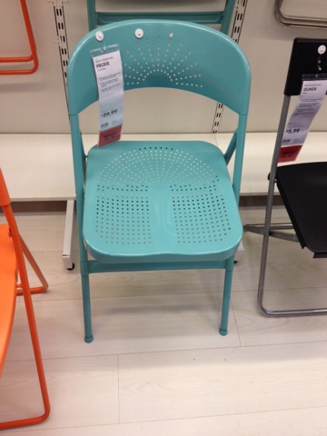
The Frode stackable chair, it is turquoise AND (weirdly) comfy too.
The Snekkersten rug was very cool as well, it would look good with my taupe walls (though maybe too matchy matchy? Maybe not as it's a pattern I guess).
mercoledì 3 giugno 2015
martedì 2 giugno 2015
Living room: Ikea Nornas + Forhoja?
Pubblicato da
interni secrets
alle
23:07
Will I went to Ikea today to see the Billy bookcase with doors, but I don't really like the look of it.
I think I'd prefer a material that didn't pretend to be something else... Natural wood looks so much better but my budget is not massive and I also need the bookcases to be shallow as they will have to be in a niche.
All the bookcases seeem so boring...
Then I saw the Nornas chest of drawers... it looks really cool and original and I guess it could even look good in a living room.
But what can I combine it with? I thought about the Nornas bookcase and maybe Forhoja wall shelves above.
I could maybe paint the Nornas chest in different colours (white, grey and possibly also some turquoise)?
I think I'd prefer a material that didn't pretend to be something else... Natural wood looks so much better but my budget is not massive and I also need the bookcases to be shallow as they will have to be in a niche.
All the bookcases seeem so boring...
Then I saw the Nornas chest of drawers... it looks really cool and original and I guess it could even look good in a living room.
But what can I combine it with? I thought about the Nornas bookcase and maybe Forhoja wall shelves above.
I could maybe paint the Nornas chest in different colours (white, grey and possibly also some turquoise)?
***
Update the day after...
It looks too busy and gimmicky, I think I will get some built-in shelves done when I have some cash, probably 25 to 26 cm deep as the niche is so shallow :-/...
Hot AND blue. Warm blues vs cool blues...
Pubblicato da
interni secrets
alle
00:41
I have just read something about warm blues vs cool blues.
http://www.realsimple.com/home-organizing/decorating/decorating-blue-ideas/ad?slide=3
Warm blues contain hints of red and some of them are denim, ocean blue, or slate blue.
Warm blues come forward (instead of receding like cool blues) and they create a cozy atmosphere.
Warms blues in painting:
http://www.janeblundellart.com/warm-blues.html
Apparently (according to Bunny Williams on Elle Decor) you can mix warm and cool blues.
Another website says that if you want to use more than one accent colour, you should use only bright or greyed ones and not mix the two.
I think I want to use a neutral palette of taupe walls and warm grey furniture with warm blues (and some cool ones) as accent colours.
http://www.realsimple.com/home-organizing/decorating/decorating-blue-ideas/ad?slide=3
Warm blues contain hints of red and some of them are denim, ocean blue, or slate blue.
Warm blues come forward (instead of receding like cool blues) and they create a cozy atmosphere.
Warms blues in painting:
http://www.janeblundellart.com/warm-blues.html
Apparently (according to Bunny Williams on Elle Decor) you can mix warm and cool blues.
Another website says that if you want to use more than one accent colour, you should use only bright or greyed ones and not mix the two.
I think I want to use a neutral palette of taupe walls and warm grey furniture with warm blues (and some cool ones) as accent colours.
giovedì 21 maggio 2015
Do light fixtures in an open space need to match?
Pubblicato da
interni secrets
alle
14:10
I need to find a light for my kitchen that looks good with the shabby-esque rustic chandelier over the dining table...
This is my kitchen:
This is my dining area:
And this is the chandelier of the dining area, so the kitchen lamp can't be too eye catching...
I saw these lamps on the Maisons du Monde website that are really cool:
This website says you should't go matchy-matchy with light fixtures in an open space, but rather match them through colour or style.
It also says combining square and round (as long as the colour and style are similar I guess) is quite cool.
Maybe this is the best choice then..., same colour and a bit rustic like the chandelier below (more industrial than shabby but I quite like the style):
+
But I am not convinced the shapes look good together... Maybe the first one should be more square to give more contrast or rounder to be more similar?
Maybe this simple Ikea lamp would look better. It has a nice milky colour and is similar in shape to the kitchen hood...
Or this (Ranerp by Ikea) which has some brass but looks more sophisticated. Mixing brass and chrome could be fun...
Yatzer interiors blog: hotel in Rome, rough luxury
Pubblicato da
interni secrets
alle
12:11
Yatzer is such a cool blog, I really like this G-Rough hotel in Rome and the words rough and luxury used together!
I like contrasts, hard and soft, rough and luxurious, feminine and masculine.
One can tell that the materials are luxurious, I like the reflective surfaces as well.
A bit too mid-century modern for my taste though, I prefer a mix of industrial and shabby chic or antique...
http://yatzer.com/g-rough-hotel-giorgia-cerulli
I like contrasts, hard and soft, rough and luxurious, feminine and masculine.
One can tell that the materials are luxurious, I like the reflective surfaces as well.
A bit too mid-century modern for my taste though, I prefer a mix of industrial and shabby chic or antique...
http://yatzer.com/g-rough-hotel-giorgia-cerulli
lunedì 18 maggio 2015
Stripes... and a couple of stars - Righe... e un paio di stelle
Pubblicato da
interni secrets
alle
22:29
Tonight I was thinking about the curtains in my living room-cum-dining room open space...
As my walls are taupe and I want to use light blue as accent colour, I think I'll stick to sand or off-white for the curtains. I want the room to hug you and relax you and make you think of the sea breeze... A kind of urban retreat with a coastal feel.
I also thought about stripes, as they give out an instantly beachy vibe.
At first I though about striped curtains, but then about a big white and light blue striped rug or striped cushions on the sofa...
And a striped tablecloth to tie the theme in...
And maybe hanging a star or two at the windows, as they do in Sweden.
I want to give the room a beachy, relaxing feel with a touch of nordic Scandi coolness.
The furniture will be mainly white and ivory and the charcoal sofa will ground it, preventing it from floating away ;-)
Image source: http://abeachcottage.com/2012/04/coastal-blue-bedroom-diy-beach-cottage-style.html
Image source: http://abeachcottage.com/2012/01/how-to-get-the-best-vintage-coastal-style-top-tip-for-great-nautical-beach-decor.html
Image via Pinterest
Image via Pinterest
As my walls are taupe and I want to use light blue as accent colour, I think I'll stick to sand or off-white for the curtains. I want the room to hug you and relax you and make you think of the sea breeze... A kind of urban retreat with a coastal feel.
I also thought about stripes, as they give out an instantly beachy vibe.
At first I though about striped curtains, but then about a big white and light blue striped rug or striped cushions on the sofa...
And a striped tablecloth to tie the theme in...
And maybe hanging a star or two at the windows, as they do in Sweden.
I want to give the room a beachy, relaxing feel with a touch of nordic Scandi coolness.
The furniture will be mainly white and ivory and the charcoal sofa will ground it, preventing it from floating away ;-)
Image source: http://abeachcottage.com/2012/04/coastal-blue-bedroom-diy-beach-cottage-style.html
Image source: http://abeachcottage.com/2012/01/how-to-get-the-best-vintage-coastal-style-top-tip-for-great-nautical-beach-decor.html
Image via Pinterest
Image via Pinterest
Accent colours: colour blocking - Colori d'accento: colour blocking
Pubblicato da
interni secrets
alle
12:45
Since I bought a sofa in a neutral colour (charcoal), I found this lovely website (Maria Killam's) that says accent colours should be present in big, medium and small "doses"
-----
-----
Siccome ho comprato un divano in un colore neutro (antracite), ho trovato questo sito stupendo che dice come i colori d'accento debbano essere presenti in quantità grosse, medie e piccole
Iscriviti a:
Post (Atom)


